
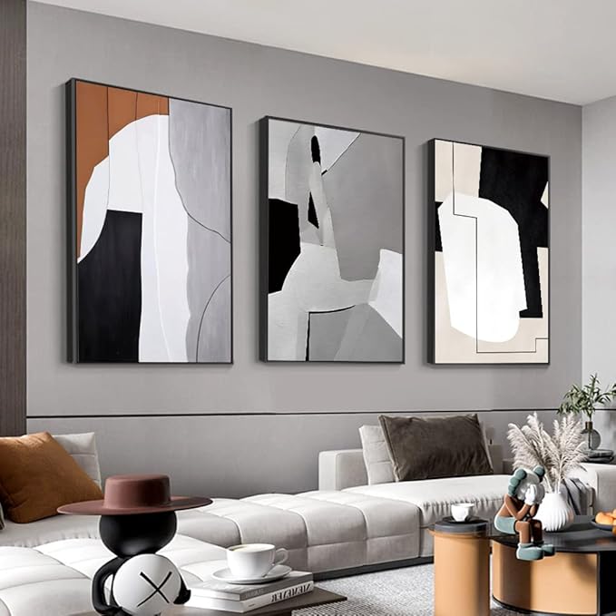
Decorating with bright colors can transform a drab space into a dynamic and vibrant haven. However, without careful consideration, bold hues can overwhelm a room rather than enhance it. Understanding the common pitfalls in decorating with bright colors is essential for creating a balanced and inviting space. Here are crucial mistakes to avoid, ensuring your colorful decor feels cohesive and refreshing.
1. Overloading the Space with Too Many Colors
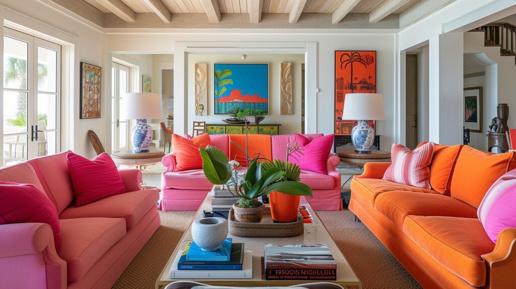
One of the most common mistakes in decorating with bright colors is using too many vibrant hues in one space.
- Tip: Limit your palette to two or three main colors. This approach allows you to create a focused and harmonious design that doesn’t overwhelm the senses.
2. Neglecting Color Balance
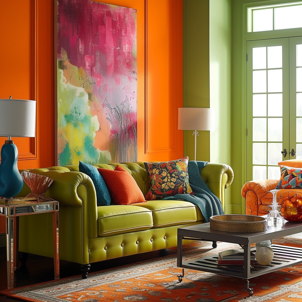
Another mistake is failing to balance bright colors with neutral tones, which can make a room feel chaotic.
- Tip: Incorporate plenty of whites, grays, or other neutrals to provide visual breaks and enhance the vibrancy of your chosen bright colors.
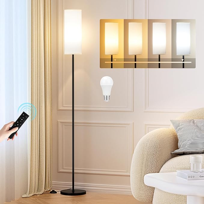
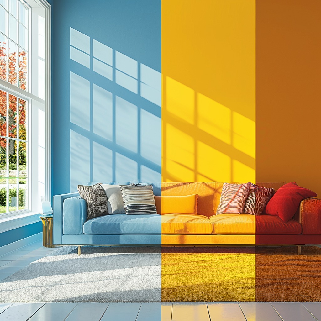
3. Forgetting About Lighting
Lighting plays a crucial role in how colors are perceived, yet it’s often overlooked when decorating.
- Tip: Evaluate the natural and artificial lighting in your space. Bright colors may appear differently under various lighting conditions, so choose hues that complement the room’s lighting.
Get yours here
4. Ignoring the Room’s Purpose
Bright colors can influence a room’s ambiance and mood, making it essential to consider the room’s function.
- Tip: Opt for energizing colors like yellows or oranges in active spaces (like kitchens or living rooms) and soothing tones in bedrooms or study areas.
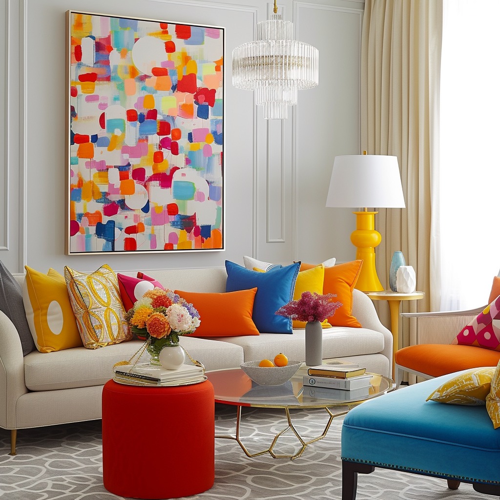
5. Clashing Patterns and Textures
While mixing patterns and textures can add depth, doing so without a strategy can lead to a disjointed look.
- Tip: Stick to a consistent color theme when mixing patterns and textures, and ensure there’s a common hue that ties everything together.
6. Disregarding the Color Flow Throughout the Home
A cohesive color flow is vital for a harmonious home, yet bright colors can disrupt this flow if not carefully integrated.
- Tip: Ensure there’s a visual connection between rooms by carrying over one or two colors throughout the home, even if it’s just through small accents.
Get yours here
7. Choosing the Wrong Paint Finish
The finish of your paint can significantly impact the appearance of bright colors.
- Tip: Matte or eggshell finishes tend to soften bright colors, making them more versatile for walls, while glossy finishes are better suited for accents.
8. Overlooking Personal Preference for Trends
While it’s tempting to follow the latest color trends, it’s essential to prioritize personal taste.
- Tip: Choose colors that you love and that reflect your personality. Your home should be a space that brings you joy and comfort, regardless of trends.
Conclusion: A Thoughtfully Colorful Home
Decorating with bright colors is an exciting way to express your style and bring energy to your home. By avoiding these common mistakes, you can ensure that your vibrant decor choices create a space that is both visually stunning and comfortably livable. Remember, the key to successfully decorating with bright colors lies in balance, thoughtful planning, and a touch of personal flair.