In the vibrant world of interior design, the mixing of prints and textures is not just a trend but an art form. It’s a strategy used by professionals to add depth, interest, and personality to any space. However, without a careful approach, this endeavor can lead to a chaotic rather than a harmonious look. This article provides you with professional guidelines to skillfully mix prints and textures, ensuring your space is dynamic, stylish, and thoughtfully curated.
Understanding the Basics of Pattern and Texture
Before diving into the mixing, it’s crucial to understand what we mean by prints and textures:
- Prints: These are the designs or patterns on fabrics and wallpapers, ranging from florals and geometrics to abstract and thematic motifs.
- Textures: This refers to the feel or visual appearance of a surface. Textures can be smooth, rough, soft, hard, glossy, or matte, each bringing a different dimension to the room.
1. Start with a Color Scheme
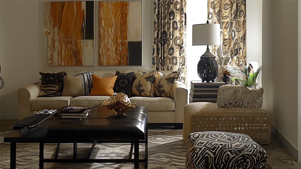
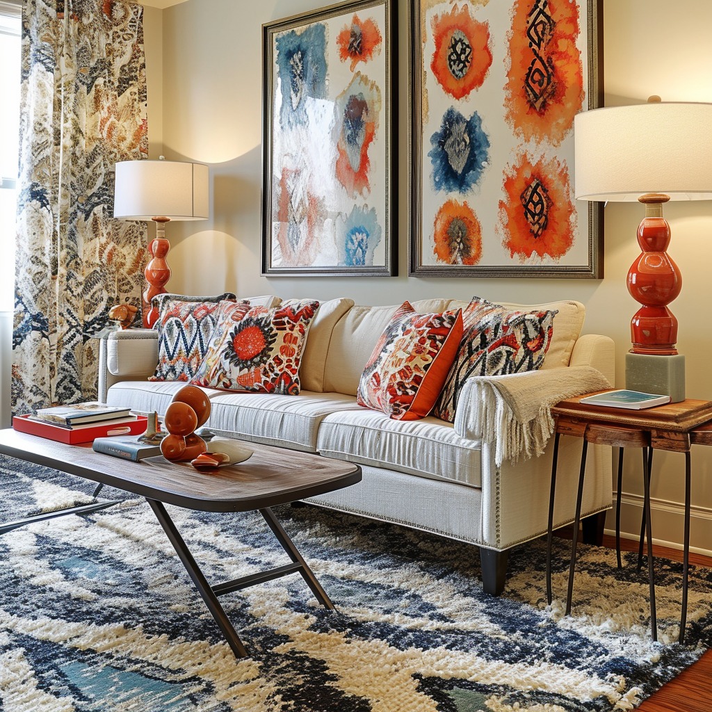
A cohesive color scheme is the foundation of successfully mixing prints and textures. Choose a primary color to dominate and one or two accent colors to support and contrast. This palette will guide your pattern and texture choices, ensuring they contribute to a unified look.
2. Balance Scale and Size
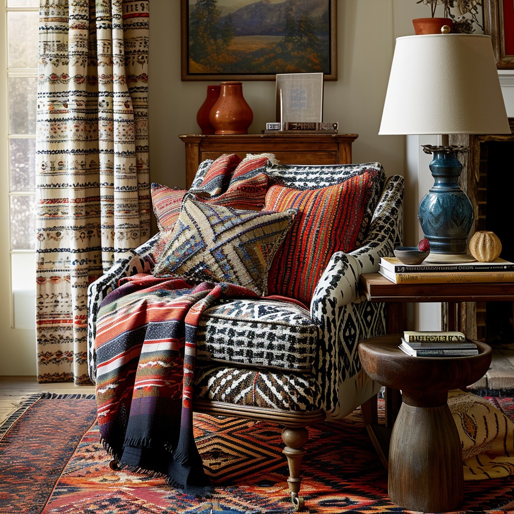
When mixing prints, vary their scale. Pair a large, bold print with a smaller, subtler one to avoid visual competition. For instance, combine a large floral wallpaper with small geometric-patterned pillows. The difference in scale draws the eye and creates a layered look.

3. Mix Textures for Depth
Textures add depth and interest. Combine different types, such as a smooth, shiny silk with a rough, nubby linen. This contrast enhances the tactile quality of the space and makes each element stand out. In colder months, thicker textures like wool or velvet can add warmth, while lighter textures like cotton or linen are perfect for summer.
4. Keep Patterns in the Same Style Family
While mixing different types of patterns, keep them within the same style family to maintain a cohesive look. For example, if you’re going for a modern look, mix geometric patterns with abstract prints. For a more traditional space, floral prints might mix well with classic stripes or plaids.
5. Use Solids as a Breather
Solid colors are the breathers in a mix of patterns and textures. They provide a place for the eye to rest and help highlight the different prints and textures around them. Use solid-colored pillows, rugs, or furniture to balance and ground your patterned pieces.
6. Distribute Evenly Throughout the Space
Ensure that prints and textures are distributed evenly throughout the room. This creates a sense of balance and prevents any one area from becoming overwhelming. If you have a bold patterned rug, consider subtler prints and textures for the curtains or throw pillows.
7. Experiment and Adjust
The beauty of design is in experimentation. Don’t be afraid to try different combinations to see what works best in your space. Sometimes, the most unexpected pairings create the most striking look. Trust your eye and adjust as needed.
Conclusion: Your Personal Pattern Play
Mixing prints and textures is an excellent way to express your personal style and create a space that feels complete and lived-in. By following these guidelines, you’ll be able to do so with confidence and creativity. Remember, the goal is to create a space that feels right to you, one that’s a harmonious blend of variety and unity. So, embrace the art of pattern play and transform your space into a testament to your unique style.